01 / A HUMAN STORY
Celebrate the people.
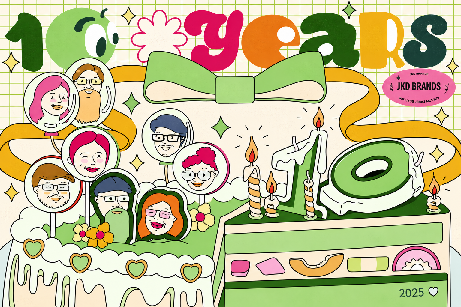
Team portraits, guest messages and the company’s history place relationships at the center of the anniversary.
 PRODUCT DESIGNER
Ten years. One shared celebration.
An anniversary event brought to life through invitations, a promotional campaign and thoughtful details that helped guests feel part of the story.
01 / Overview
In 2025, JKD BRANDS celebrated ten years with an anniversary event for its community. The event became the center of the design project: a reason to gather, thank the people behind the business and introduce guests to the team and its work.
I developed the strategy, illustrations and visual design, alongside event planning and scheduling. The work extended from printed and social invitations to a selected-product promotion, then into the materials guests encountered, used and took home.
BEFORE / INVITE & INFORM
Print and social invitations.
Anniversary offers across print, social and email.
DURING / WELCOME & INVOLVE
Sign-in materials, wearable team cards, a message poster and a custom cake.
Explore the event ↗BEYOND / REMEMBER & CONNECT
A ten-year story, material samples, project inquiry cards and thank-you gifts.
Explore the takeaways ↗02 / Design direction
The challenge was to connect promotional communication with a welcoming event experience. Each item had a different job: an invitation needed clear logistics, a promotion needed a visible offer, and a sign-in sheet needed room to write.
I used the anniversary as a shared visual thread. The expressive “10,” illustrated team, cake, ribbons and thank-you messages made the materials feel related, while a consistent grid kept practical information easy to find.
01 / A HUMAN STORY
Team portraits, guest messages and the company’s history place relationships at the center of the anniversary.
02 / A RECOGNIZABLE SYSTEM
Characterful lettering, green accents and celebration motifs connect a small card to a large event poster.
03 / A PURPOSE FOR EACH PIECE
RSVP, explore an offer, introduce yourself, sign a message or leave a project idea. Each format supports a specific moment.
Forest and sage green anchor the brand. Pink, orange and yellow add celebration; cream backgrounds and ruled information bands give the expressive artwork structure.
03 / Before the event · Invitation
The invitation introduces the event through an illustrated anniversary cake, team portraits and a ribbon tied across the composition. It establishes the visual language guests would meet again at the celebration.
I adapted the invitation for print and social media. The artwork creates recognition, while the dedicated information area keeps the event date, Anchorage location and RSVP details together.
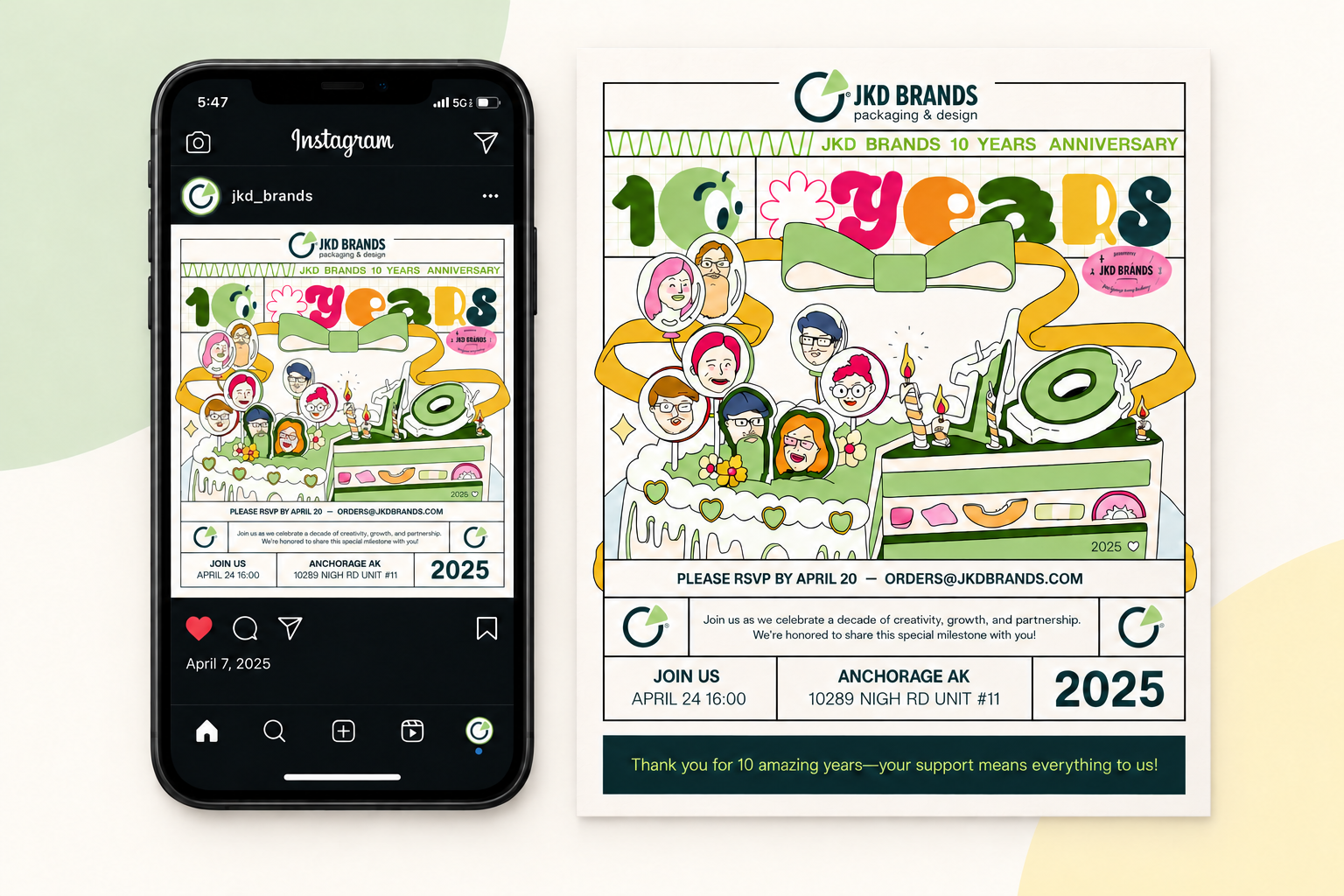
SOCIAL MEDIA
A complete invitation designed to be encountered in the feed.
A physical invitation carrying the same event details and illustration.
04 / Anniversary promotion
Alongside the event, JKD celebrated its anniversary with 10% off selected products and services: PopTop, Pouch/Mylar and Label Service. I designed the promotion for social media, print and email.
Eyes, hands and gestures turn the packaging products into characters without losing their recognizable forms. The large offer, category names and recurring anniversary grid connect the series to the event.
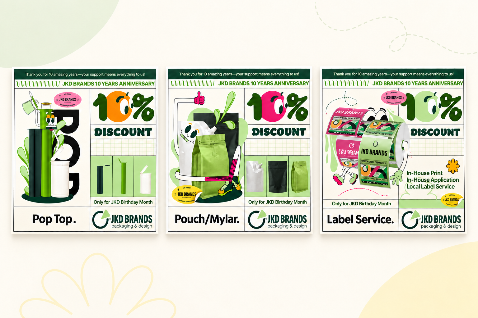
The product series introduces each category; the combined artwork brings the offer together. A compact horizontal banner carries the same anniversary message into a shorter format.
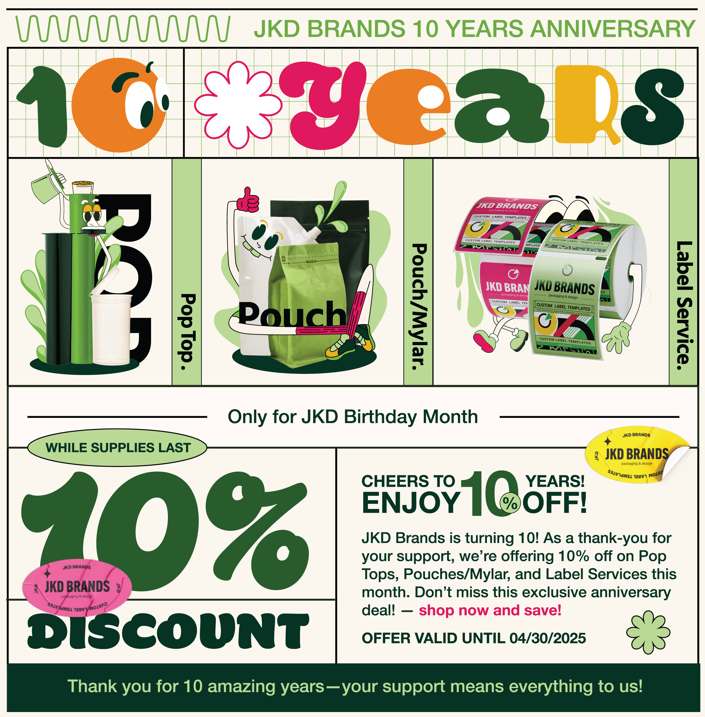
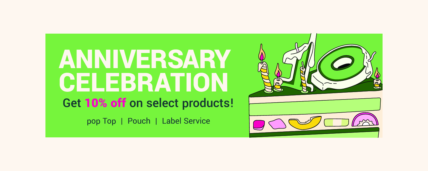
Historical campaign: the selected-product offer ran in April 2025. All digital artwork above is preserved from the supplied files.
05 / At the event
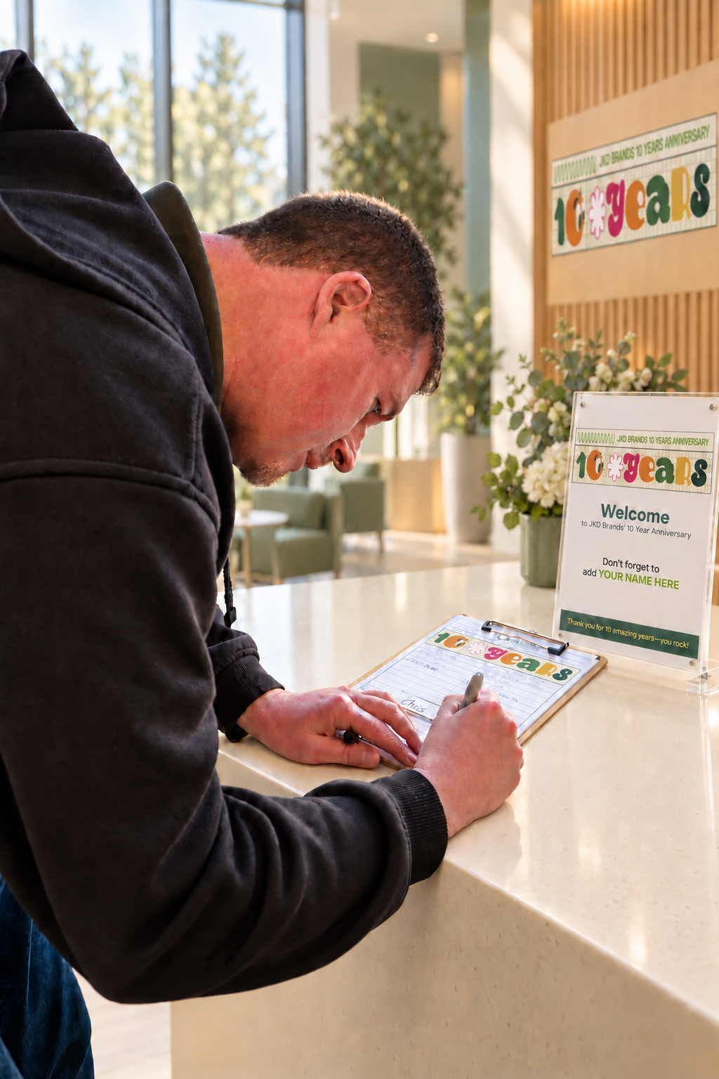
The event materials made the anniversary something guests could participate in. I planned the visual experience around arrival, introductions, shared messages and celebration.
The design language stayed recognizable throughout, but the emphasis changed with the task: a clear table for check-in, large names for meeting the team, and open space on the poster for guests’ own words.
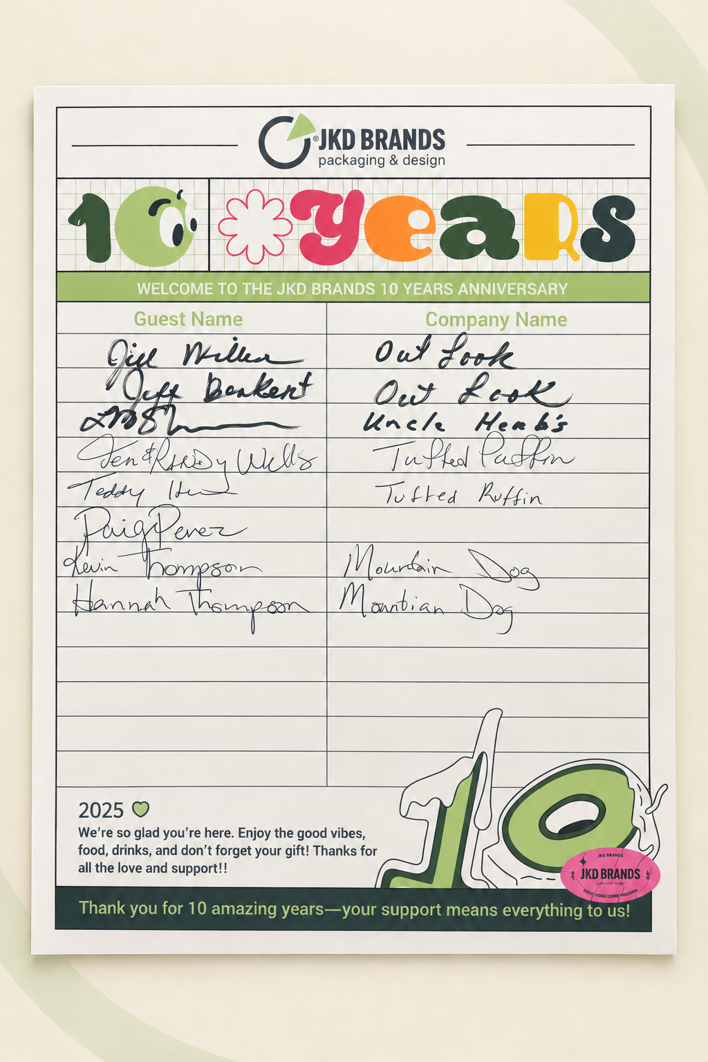
The branded sign-in sheet uses the anniversary header to welcome guests, with a simple two-column layout for guest and company names.
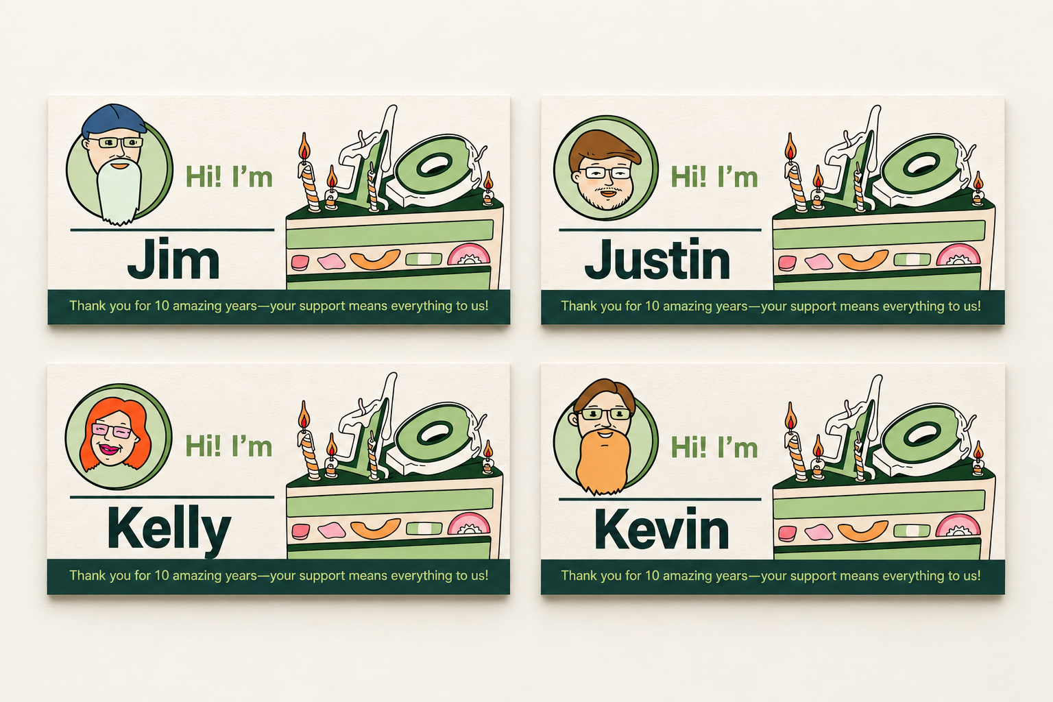
The team wore illustrated name cards so guests could recognize who they were speaking with. Clear names and distinctive portraits turn the shared visual identity into a personal introduction.
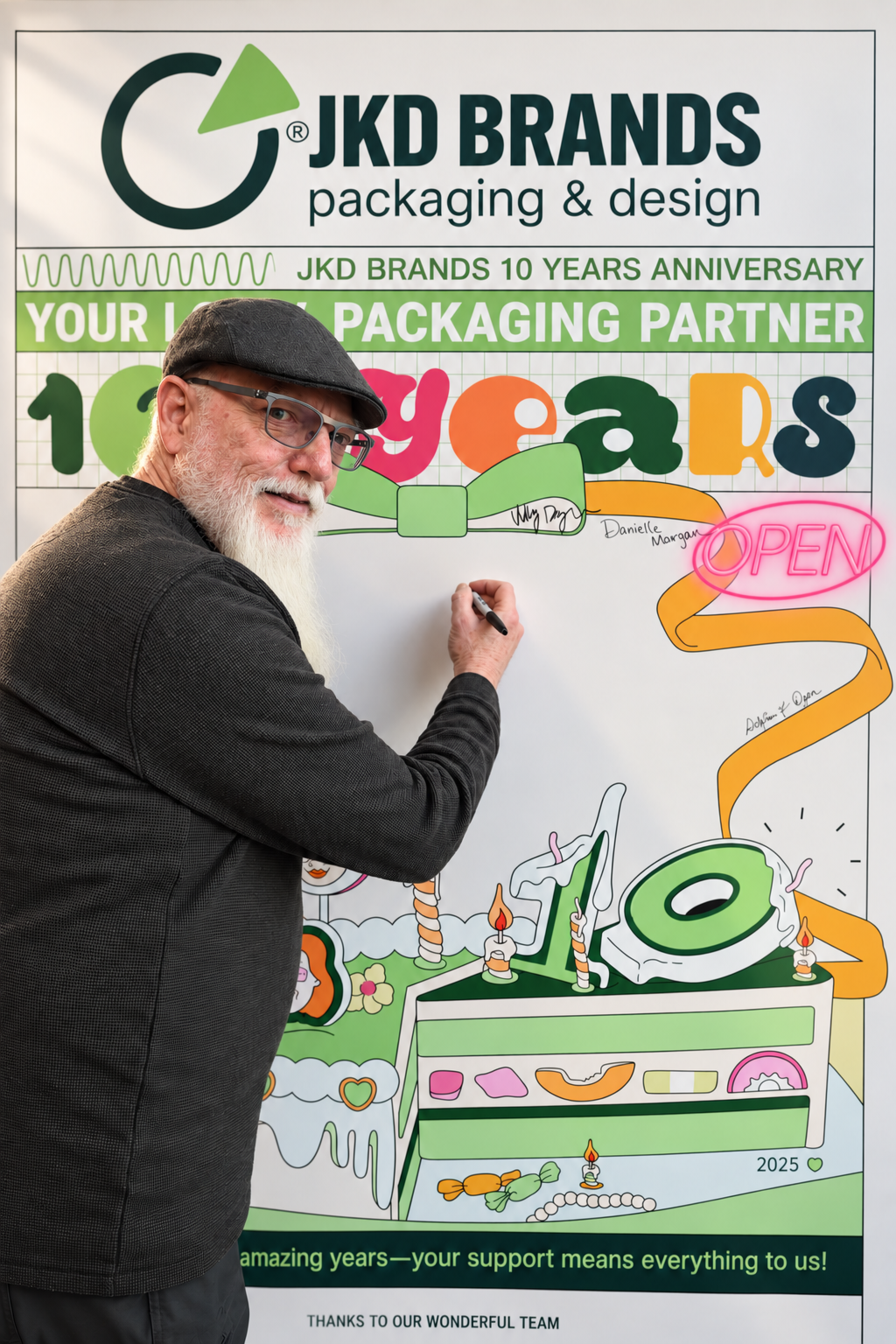
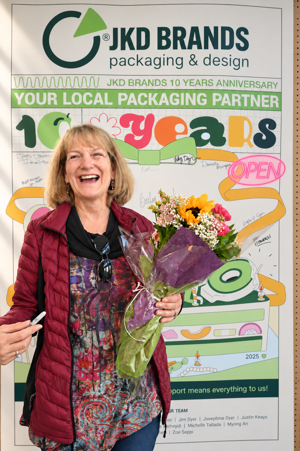
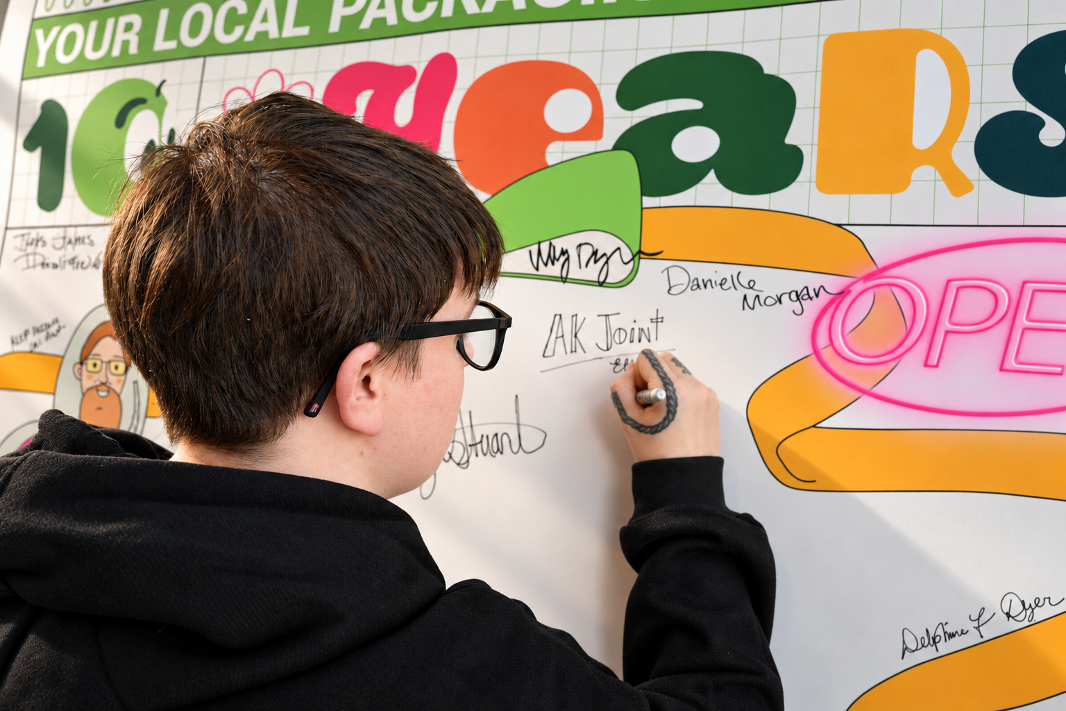
The large anniversary poster invites guests to sign and leave a message. Its open center makes room for participation, while the border illustration keeps it connected to the campaign.
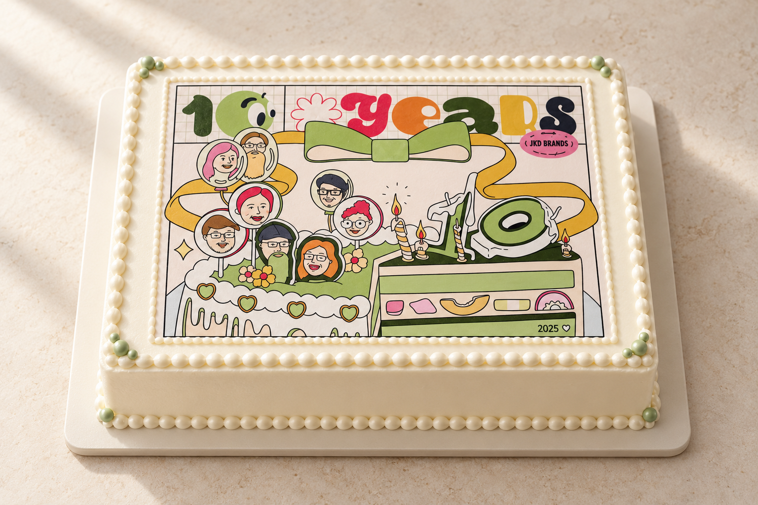
The custom cake carries the same anniversary artwork into the celebration itself. The illustrated cake from the invitation becomes a graphic on a real cake, connecting the first communication to a shared event detail.
06 / Stories, takeaways & next conversations
The supporting materials gave guests several ways to engage with JKD beyond the celebration: read its ten-year journey, explore print finishes, write down a possible project and leave with a thank-you.
These pieces carry the same visual language into more detailed and personal interactions. Together, they connect the company’s history with the relationships that could shape its next chapter.
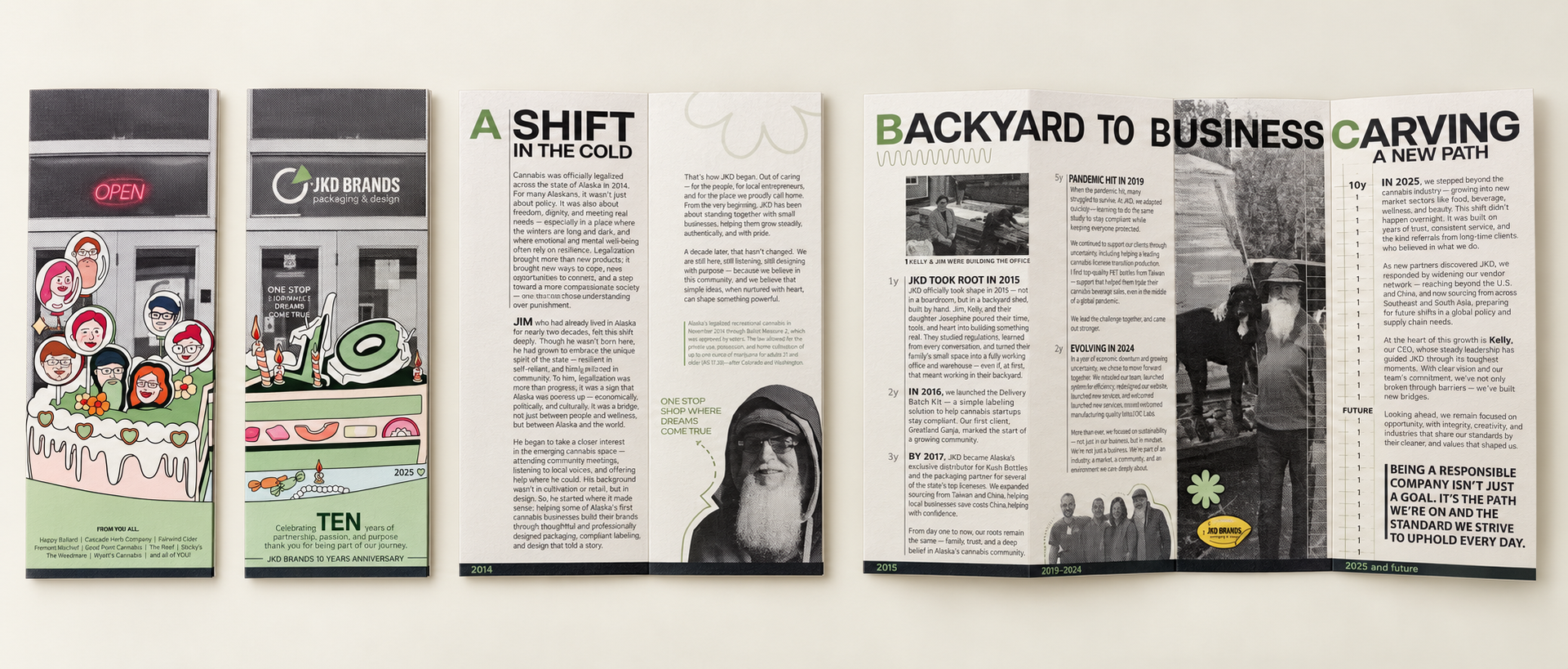
The foldout brochure tells JKD’s story through dates, large editorial headings and halftone photography. Its illustrated cover connects it to the celebration; the interior gives the longer narrative room to unfold.
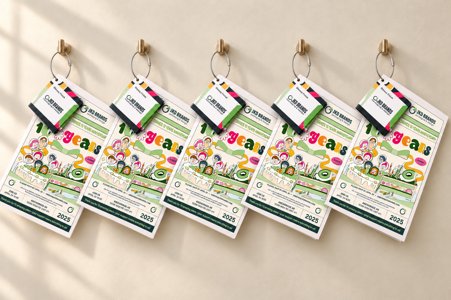
Anniversary sample packs invite guests to explore materials and finishing options. The branded cover gives the practical samples a place within the event’s visual system.
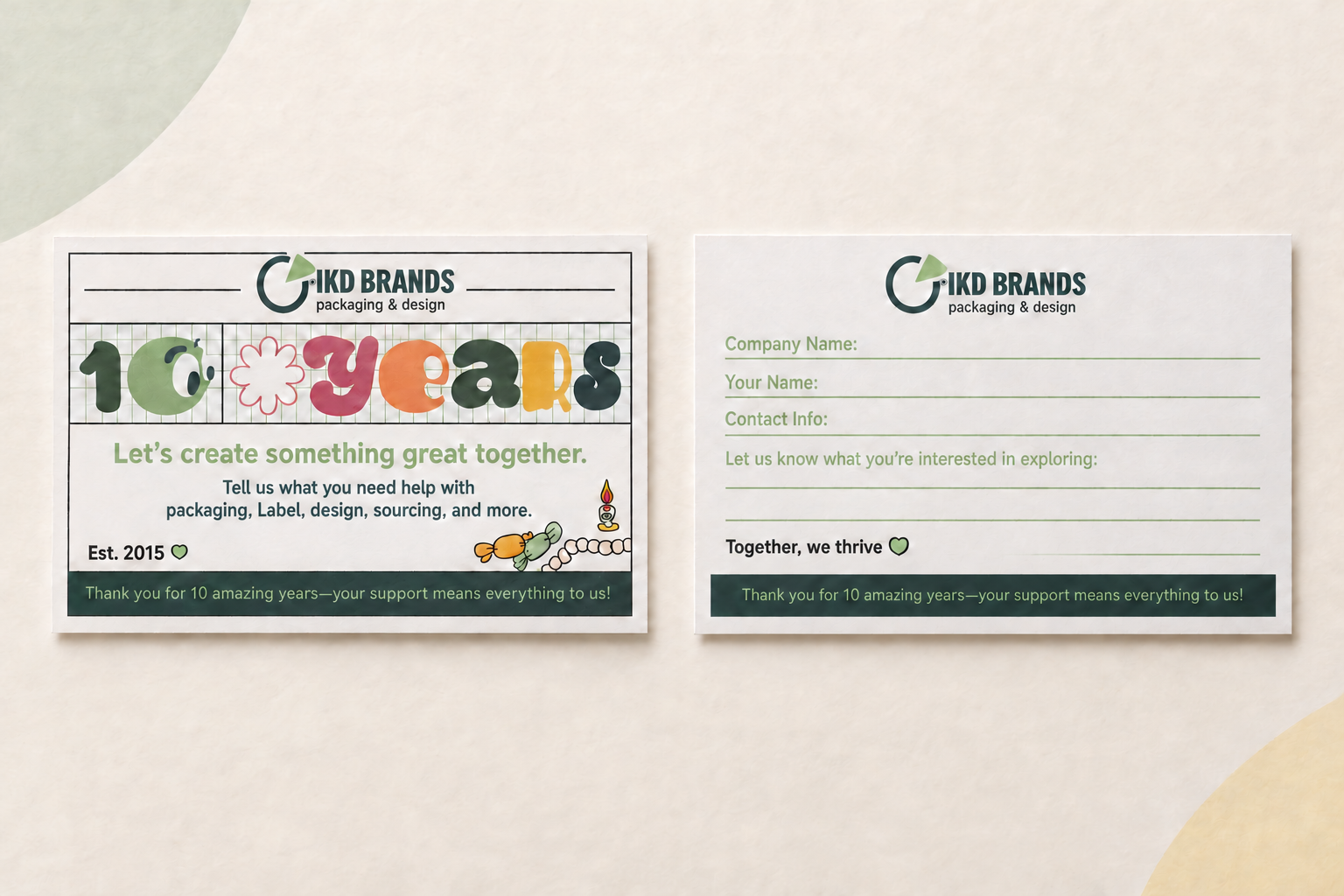
The project inquiry card asks guests for their company, contact details and what they are interested in exploring. Its friendly front invites a conversation; the reverse provides space to write a concrete idea.
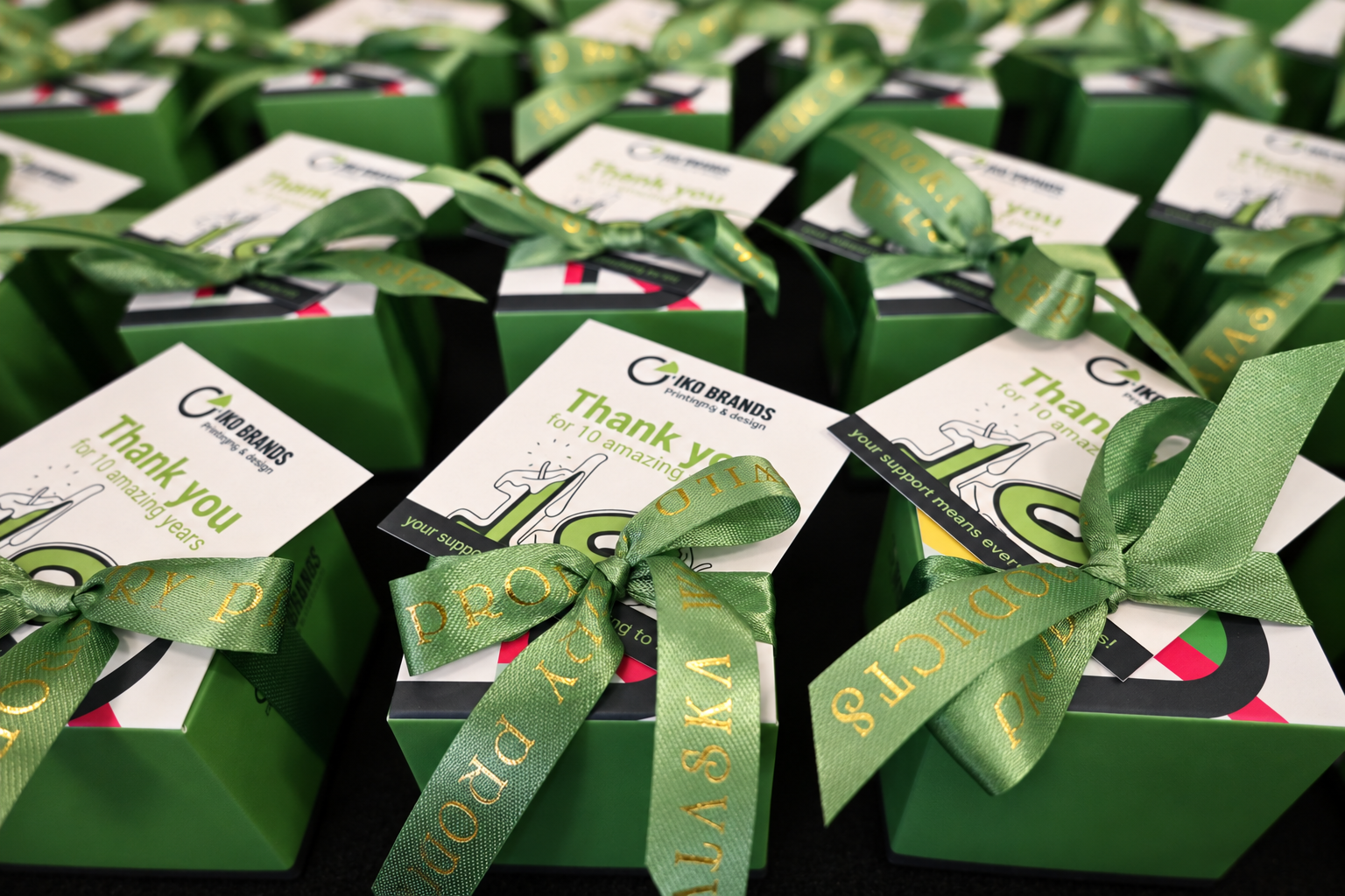
Green gift boxes, ribbon and illustrated thank-you cards carry the anniversary message home. A small printed piece gives the takeaway the same personal tone as the invitation.
Reflection / One connected body of work
The anniversary event gave every design a clear role. Invitations opened the conversation, promotions communicated the offer, and the on-site materials supported introductions, participation and discovery.
Working across strategy, planning, illustration and visual design allowed me to maintain that continuity—from a social post to a wearable name card, a handwritten wish and a project idea left on a response card.