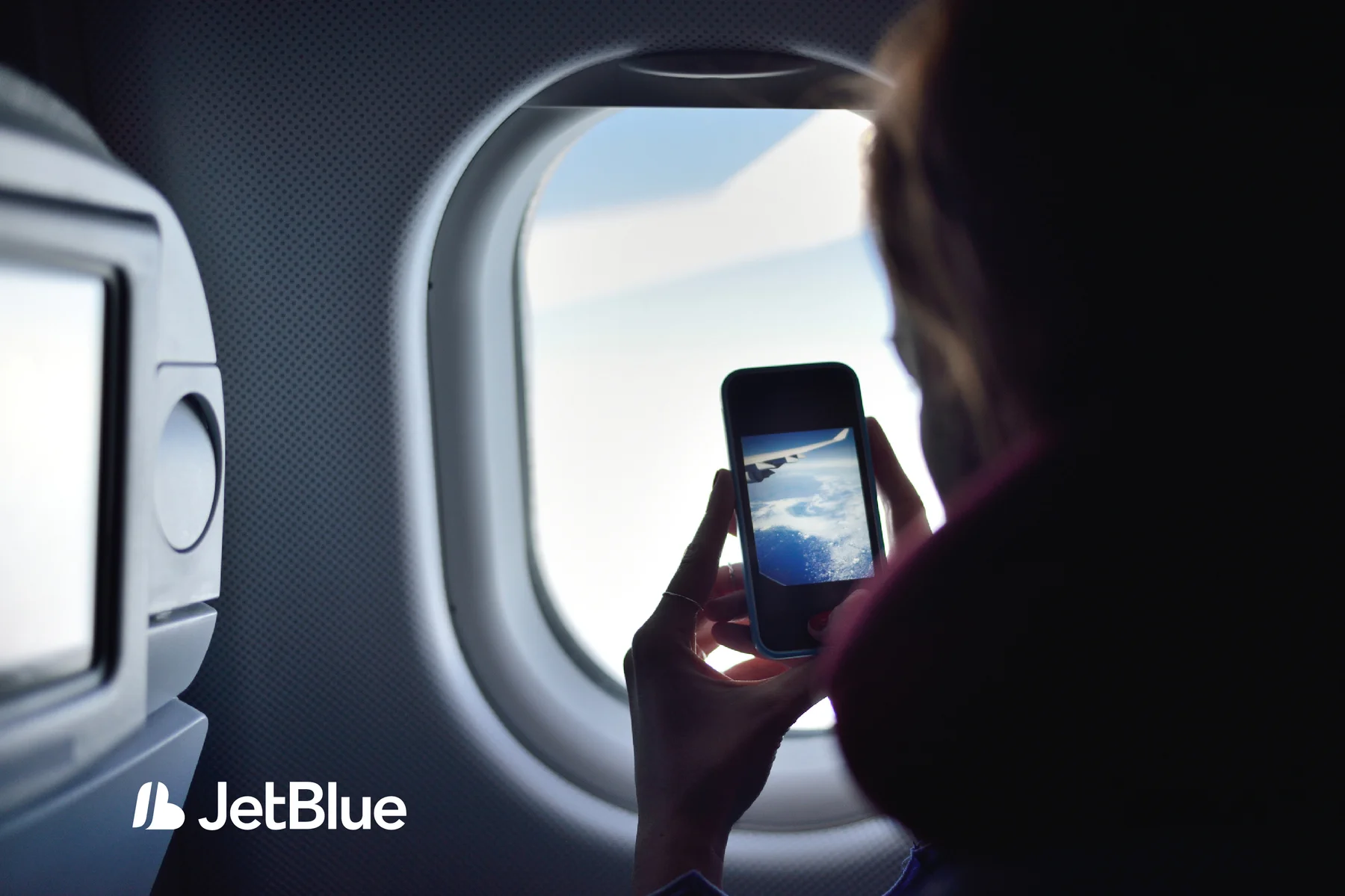
JetBlue
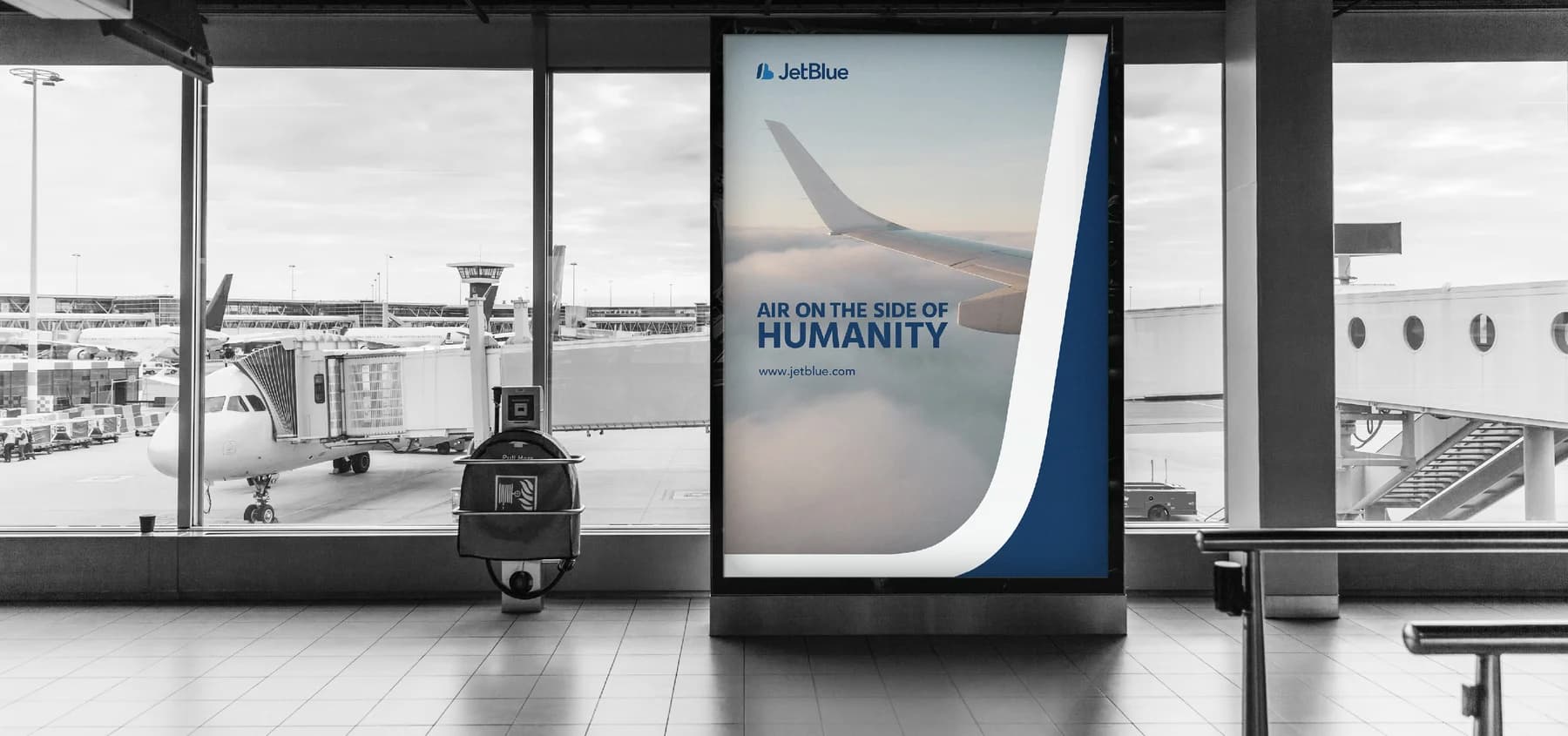
Air on the side of humanity.
A connected visual identity, from the first booking to the experience on board.
01 / Overview
A human idea, expressed through design.
This rebranding project takes JetBlue’s “Air on the side of humanity” message as its starting point. Honesty, trust, mutual respect, and a commitment to improvement inform the direction.
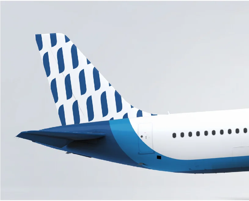
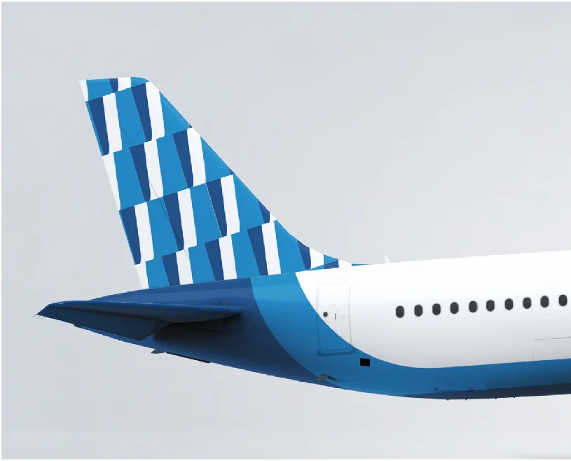
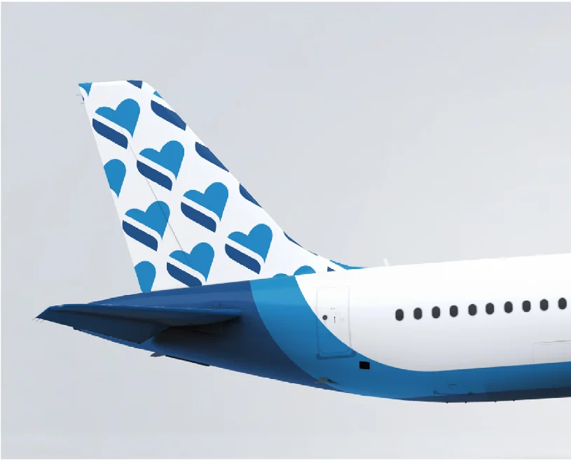
The identity extends across the airline experience: aircraft, printed materials, digital interfaces, airport environments, and the cabin.

02 / Identity
One recognizable system.
A blue palette and a distinctive symbol connect the brand’s touchpoints. The brand book defines the use of logo backgrounds, scale, color, typography, and symbol construction.

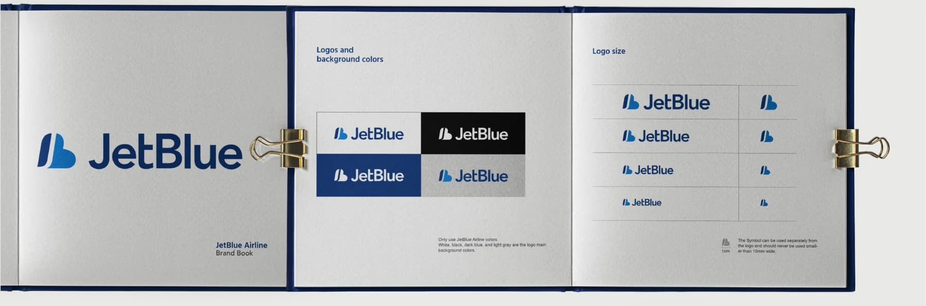
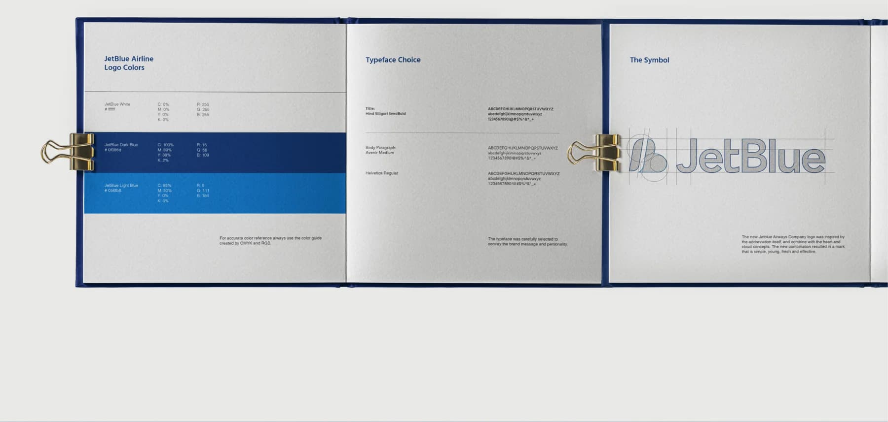
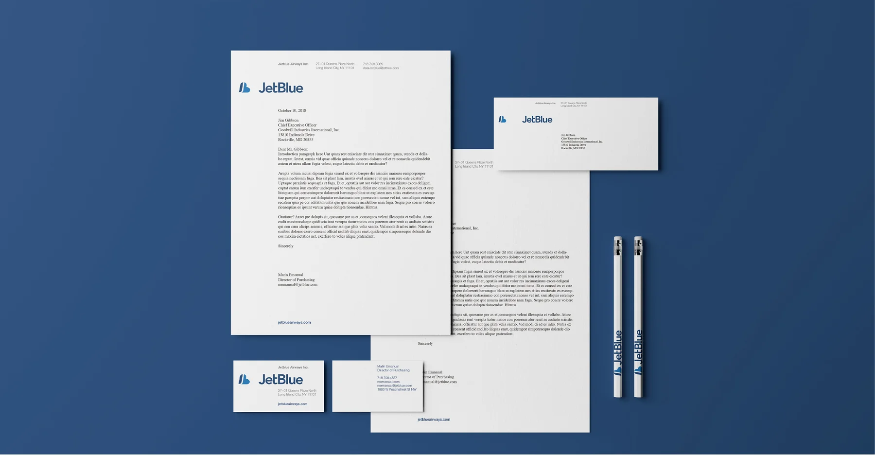
From guidelines to everyday materials
The same identity carries through correspondence, business cards, and stationery.
Brand message
Air on the side of humanity.
04 / Experience
The brand, throughout the journey.
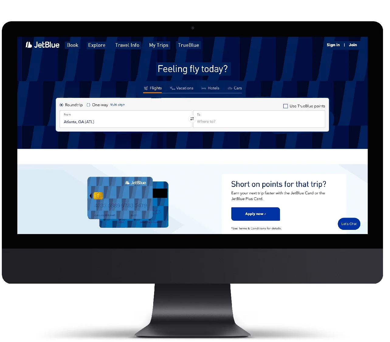
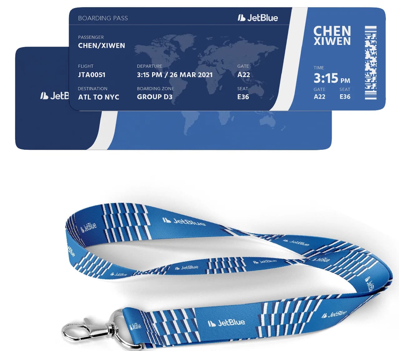
Passenger touchpoints are grouped into three stages, showing how the proposed identity carries from digital planning into physical environments and on-board details.
Before departure
Website · Boarding pass
Explore applications ↗At the airport
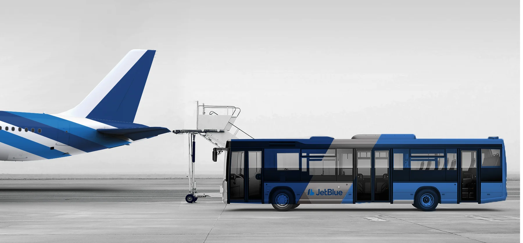
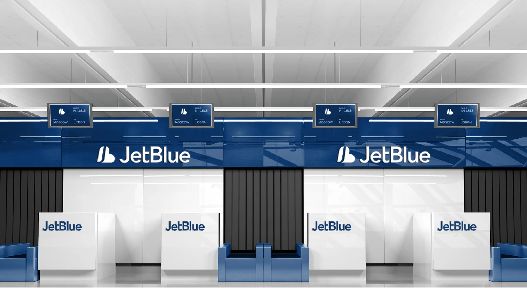
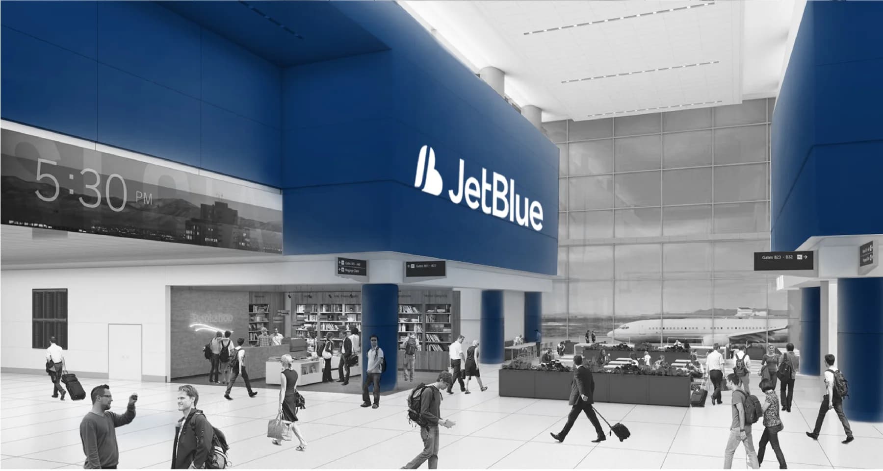
Signage · Check-in · Shuttle
Explore applications ↗On board
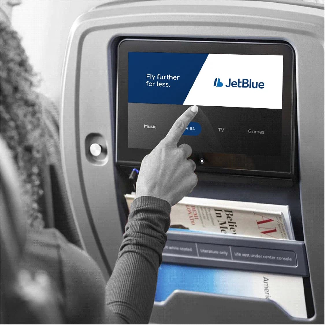
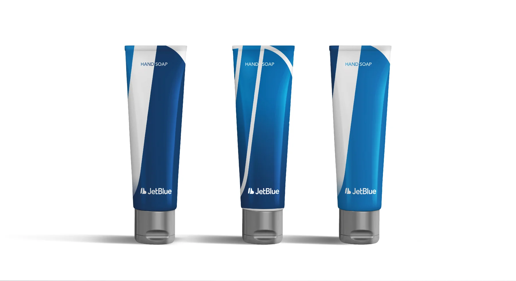
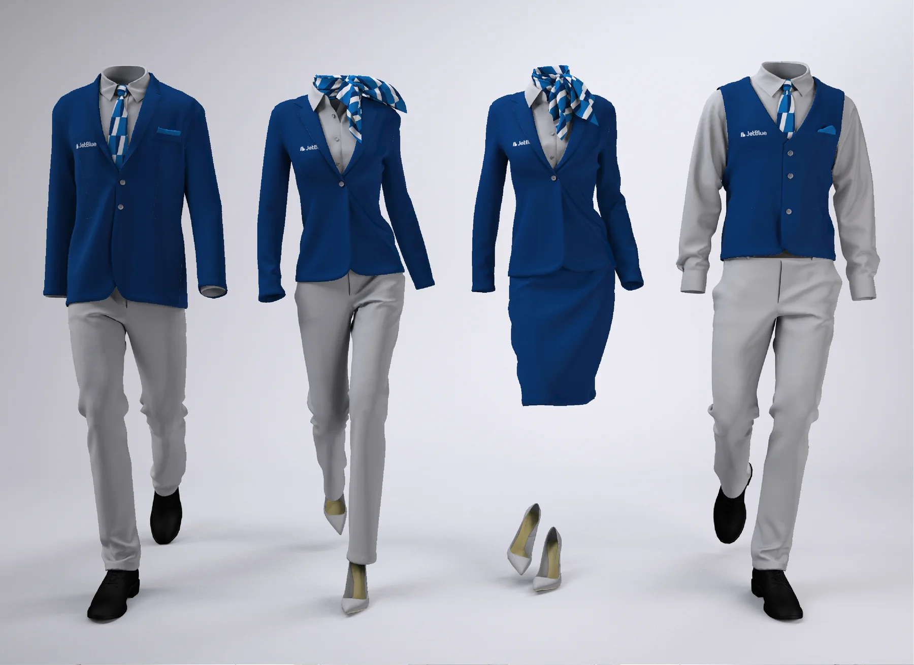
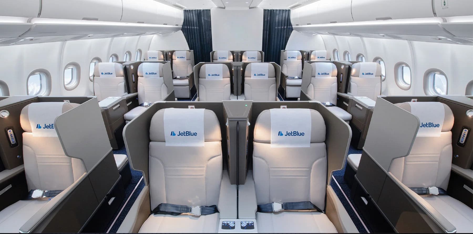
Cabin · Uniforms · Amenities
Explore applications ↗Application map · Proposed brand touchpoints
01Before departure
Digital and printed materials set a consistent tone for the journey.
02At the airport
Large-scale branding connects the terminal, check-in area, and campaign placements.
03On board
The visual system continues through the smallest details of the passenger experience.