
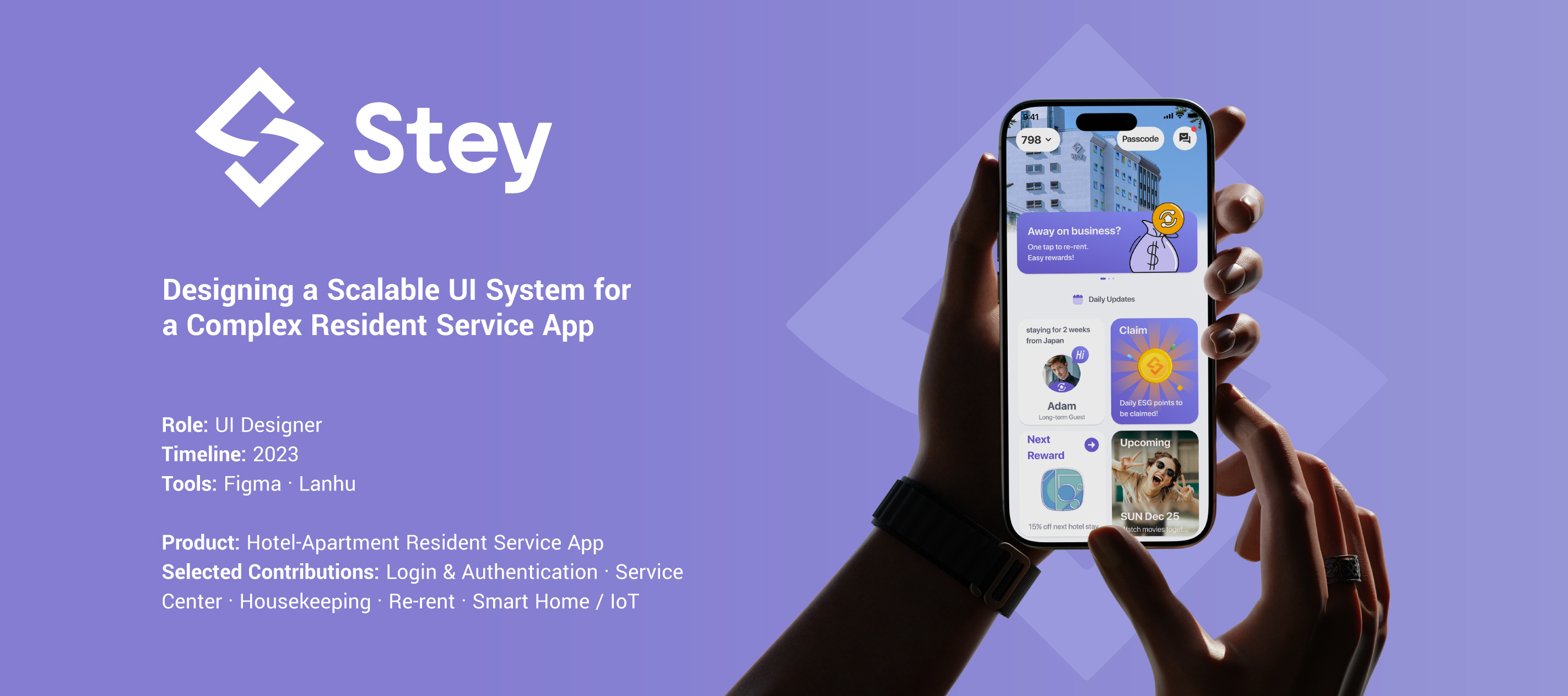
Stey App
One connected experience.
Every resident, every day.
A consistent interface system across authentication, resident services, and connected living.
Overview / Stey App
A service ecosystem, designed to feel like one app
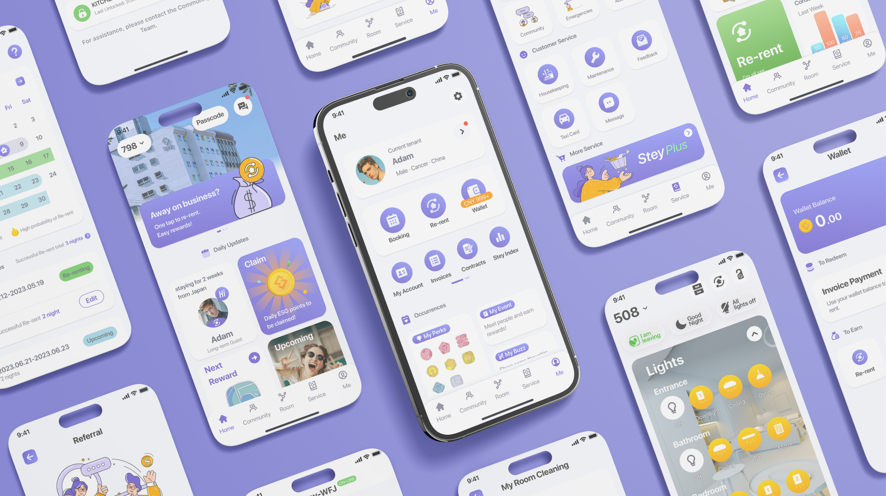
Stey is a resident service app for a hotel-apartment platform, combining long-term rental flexibility with hotel-style services and amenities.
Full resident services
Access to the complete service experience, including Re-rent.
A focused guest experience
Limited functionality within the same consistent interface system.
As one of several UI designers on the team, I translated PM requirements and interaction specifications into consistent, scalable interface solutions across five service modules.
My focus was not visual novelty, but designing a resilient UI system that could accommodate different user roles, business rules, physical constraints, and a high density of edge cases.
Context / Stey App
Complex rules. Clear experiences.
Stey combined multiple service experiences within a single product, each governed by different permissions, quotas, availability rules, and physical-world constraints.
A shared state framework
- 01Default→
- 02Input→
- 03Validation→
- 04Ready→
- 05Error / Success / Blocked
At the same time, these different experiences needed to feel like one cohesive product.
How might we translate complex product logic and edge cases into interfaces that remain clear, consistent, and scalable across different users and services?
Role-Based Experiences
Different users needed different levels of access without requiring completely separate page structures.
Edge-Case Resilience
Flows needed to clearly communicate errors, limitations, unavailable resources, and successful actions.
System-Level Consistency
Patterns needed to work across multiple modules rather than being solved independently for each screen.
My role / Stey App
Turning requirements into a reusable UI system
I worked as one of several UI designers on the project.
PMs defined feature requirements and business logic, while interaction specifications established the intended flows. I translated these requirements into visual interfaces, extended existing design patterns, and iterated based on team feedback.
My process
- 01PM requirements→
- 02Interaction specifications→
- 03UI design→
- 04Pattern & component reuse→
- 05Edge-case states→
- 06Feedback & iteration
Design approach
Consistency
Similar interactions should use familiar visual and interaction patterns across the product.
Scalability
Components should support multiple states and contexts rather than being designed for a single screen.
Constraint Visibility
Important limitations should be communicated before users commit to an action whenever possible.
Severity-Based Feedback
The intensity of feedback should match the impact of the condition, from inline validation to blocking states.
01 / Stey App
Login & Authentication
Designing a Consistent Multi-State Flow
The Login experience supported Mobile, Email, and Temporary Login.
Each method required different validation and error states, but the overall interaction structure remained consistent.
State framework
- 01Default→
- 02Input→
- 03Validation→
- 04Ready→
- 05Error / Success / Blocked
Progressive Validation
CTA availability responded to input completion in real time.
This helped users understand when the form was ready to submit instead of discovering incomplete input only after attempting to continue.
Two Levels of Feedback
I differentiated between input-level and action-level failures.
Field-level error: Red border + inline message
Action-level failure, such as wrong OTP: Toast notification
This created a clear distinction between invalid information and a failed action.
Escalated Security Feedback
Repeated authentication failures triggered a full-screen blocking modal rather than a lightweight notification.
The feedback became more disruptive as the severity of the security condition increased.
Design Principle — Severity-Based Feedback
Interactive prototype
Login & Authentication
Choose a sign-in method and explore validation, verification, and feedback.
Use the scenario buttons to switch login methods. Sample credentials appear below the phone.
02 / Stey App
Housekeeping
Designing for Shared Resources & Constraints
Housekeeping was one of the more complex service flows because it combined scheduling, quotas, shared resources, preferences, cancellation, rescheduling, and availability constraints.
I translated this complexity into a centralized calendar experience supported by reusable interaction patterns.
A complete service lifecycle
- Monthly schedule and remaining quota
- Today / Upcoming / Completed tasks
- Cancellation and rescheduling
- Date availability
- Cleaning preferences
- New cleaning requests
- Quota-exceeded states
- Shared resident calendar
Interactive prototype
Housekeeping
Schedule a cleaning or explore the read-only co-resident experience.
Switch resident roles above the phone. Select a day to explore cleaning tasks.
Calendar as the Navigation Hub
A single monthly calendar provided an overview of past and upcoming housekeeping activity.
This reduced navigation depth and gave residents one consistent context for understanding their housekeeping schedule.
Making Constraints Visible
The remaining housekeeping quota was displayed prominently at the top of the experience.
Instead of allowing users to complete a request only to discover insufficient quota later, the limitation was surfaced before they committed to the action.
Design Principle — Constraint Visibility
State-Driven Service Workflow
Designed a state-driven housekeeping workflow that accounts for the full task lifecycle and key edge cases—including upcoming, completed, cancellation, rescheduling, and over-capacity states—while providing clear feedback and recovery paths for each action.
Reducing Repetitive Setup
Cleaning preferences included options for trash, dusting, linens, towels, floors, and bathroom cleaning.
I used an icon-based selection grid rather than a traditional checkbox list to make multiple options easier to scan.
The experience also included an option to apply the current preferences to the remainder of the stay, allowing residents to preserve the same selections across future housekeeping requests without repeating the setup.
03 / Stey App
Re-rent
Designing for High-Impact Actions
Re-rent is a distinctive Stey feature that allows long-term residents to make their vacant room available while traveling.
Unlike a standard booking flow, the experience involves date availability, predicted re-rent probability, booking conflicts, agreements, room preparation, and physical access.
From availability to activation
- 01Select duration→
- 02Select dates→
- 03Review availability→
- 04Confirm agreement→
- 05Prepare room→
- 06Start Re-rent
Interactive prototype
Create a Re-rent
Start a new Re-rent, choose dates, review the rules, and confirm.
Choose a step above the phone or follow the complete creation flow.
Interactive prototype
Manage & Edit a Re-rent
Review existing stays, change dates, and manage cancellations.
Scroll inside the phone to explore available actions for each Re-rent.
Turning Predictive Data into Actionable Guidance
The product surfaced dates with a higher probability of being successfully re-rented.
Instead of presenting this as a complex metric, I translated it into a simple visual cue — a flame icon — so users could factor the prediction into date selection without adding unnecessary analytical complexity.
Intentional Friction for High-Impact Actions
Starting a Re-rent affects room access and physical availability, so speed was not the only design priority.
The activation flow included:
15-minute countdown + room-preparation checklist + “Not Ready” exit
These steps introduced intentional friction before the action affected physical room access and availability.
Reusing existing patterns
The date-range calendar extended the single-date calendar pattern established in Housekeeping.
The illustration-based status modal was also reused for conflict and attention-required states.
This allowed the new feature to build on familiar interaction patterns rather than introducing a separate visual language.
Design Principle — Scalability
04 / Stey App
Smart Home & IoT
Designing for Physical-World Feedback
The Smart Home module connected digital controls to physical devices inside the apartment — including lighting, climate, curtains, water and air purifiers, and door lockers
The interface needed to communicate not only what the user selected, but what was happening in the physical environment.
Interactive prototype
Smart Home & Cabinet Locks
Explore room controls, individual cabinet locks, and the lock-all action.
Select a cabinet, then slide right to confirm locking or unlocking.
Room Control, Organized by Space
Lighting, HVAC, curtains, and purifier controls were grouped by physical zone:
Entryway · Bathroom · Bedroom
Rather than presenting devices as a flat list, the structure organized controls around the physical layout of the apartment and created a closer relationship between the interface and the resident's physical environment.
At-a-glance locker status
Distinct visual states make locker status easy to scan.
- Locked
- Action required
- Unknown / Abnormal
Efficiency + Control
The interface provided both:
Lock All and Individual locker controls
This allowed users to complete common bulk actions efficiently while preserving control over individual lockers when needed.
System / Stey App
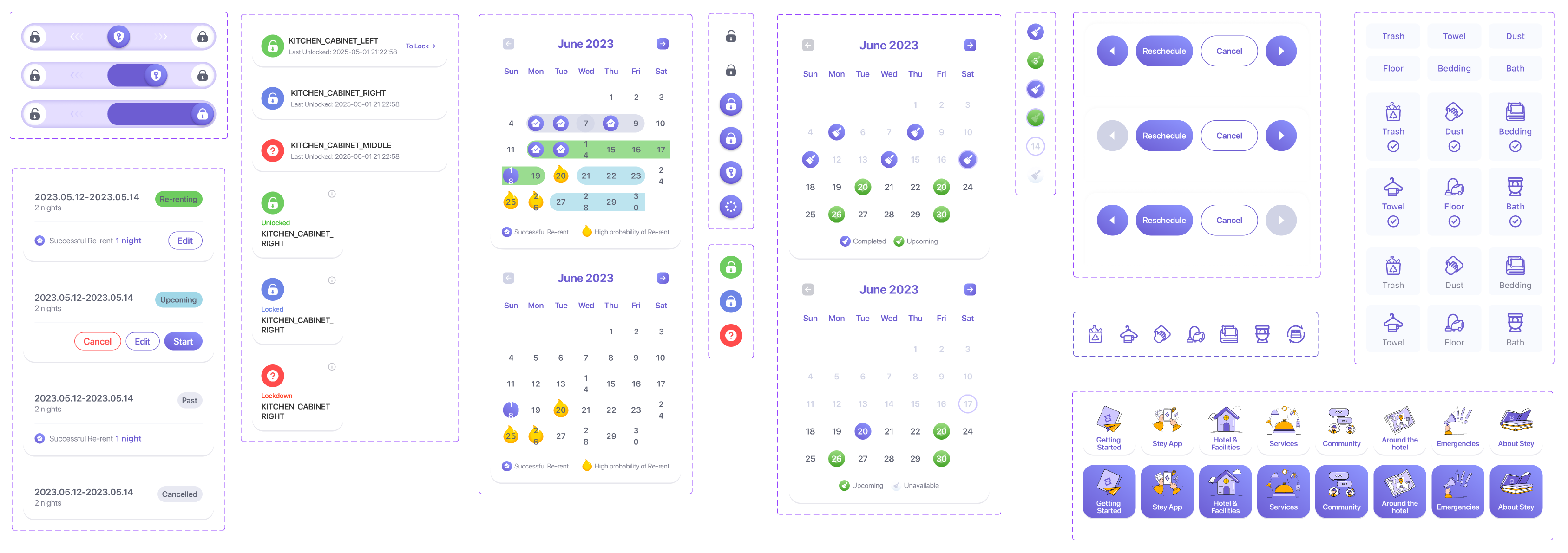
Patterns that work across modules
Building a Reusable UI System
Although the modules served different purposes, the core interaction patterns were designed to extend across the product rather than live within a single screen. The system was not only consistent-looking; its patterns could evolve and be reused across different contexts.
Reflection / Stey App
From individual screens to connected systems
Stey reinforced for me that UI design in a complex service product is not only about creating individual screens. It is about building a system that can accommodate different users, business rules, constraints, and edge cases while remaining consistent and understandable.
Systems Thinking
This project reinforced the value of designing patterns that could extend across modules rather than solving each screen independently.
State Thinking
I became more deliberate about treating edge cases and system states as part of the core experience rather than exceptions added at the end.
Next Step
My role focused primarily on translating established requirements and interaction specifications into UI. In future projects, I want to participate earlier in defining interaction logic, identifying user problems, and validating solutions with users.
That is the direction I want to continue growing toward as a product designer.